MNactivist
Research and Design for connecting civilians to civic engagement
Summary
After conducting a series of qualitative interviews with civilians who are civically engaged, we re-evaluated the goals of the application and the end-user.
I identified a key user-group being under prioritized; event organizers. I expand this finding into a re-prioritized product strategy which seeks to enable organizers as a first-step toward success in the application. The application cannot succeed without organizers utilizing the platform to share and aggregate their events. Without this, there will be no content valuable to end-users.
While my initial reports targeted, “quick-wins”, after conducting further research we decided to pursue a new strategy of re-envisioning the app itself.
My design strategy pursues elevations within the application, allowing users to jump in and out of tasks with ease, while maintaining their orientation.
Forms, Navigation and Usability
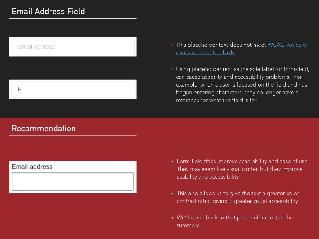
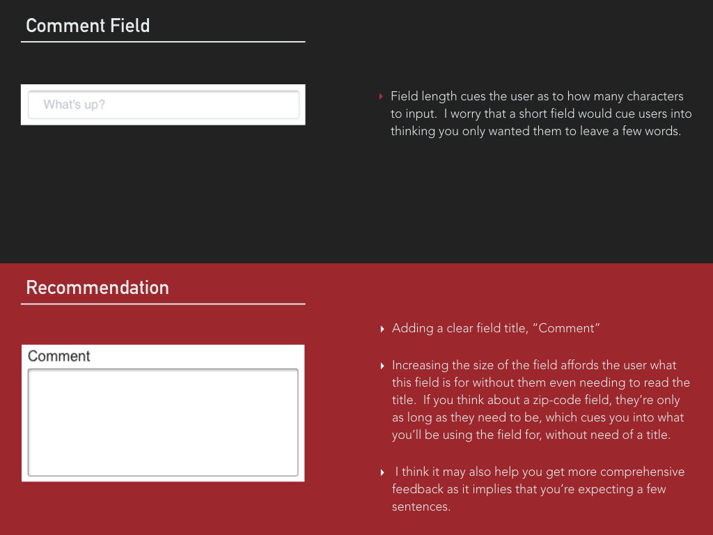
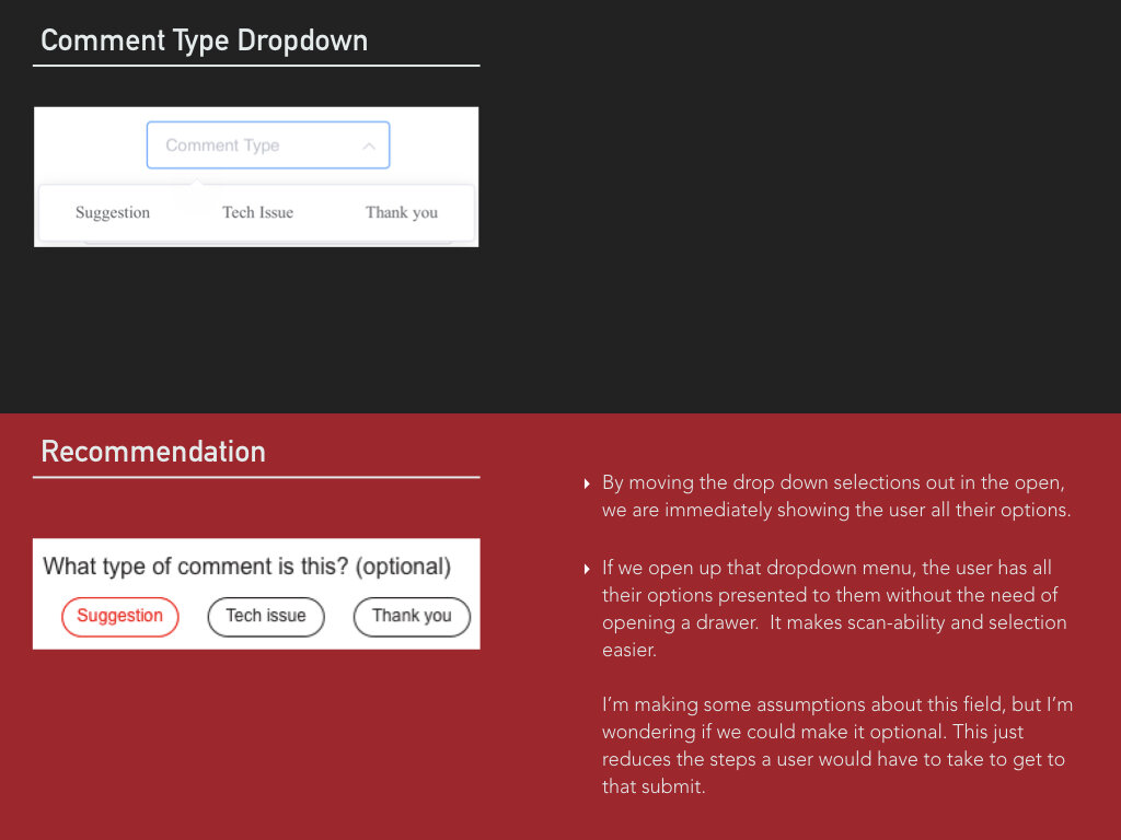
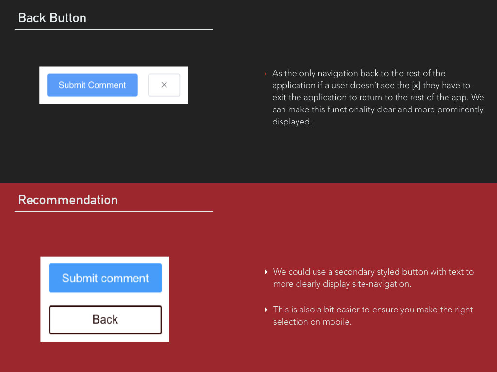
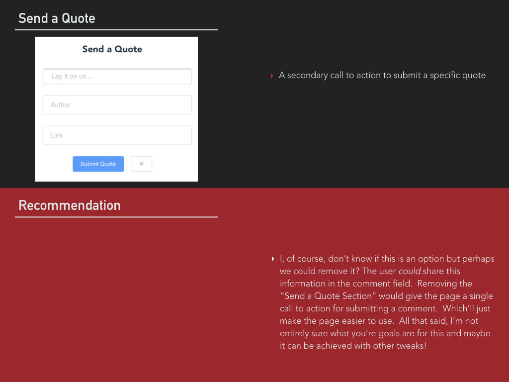
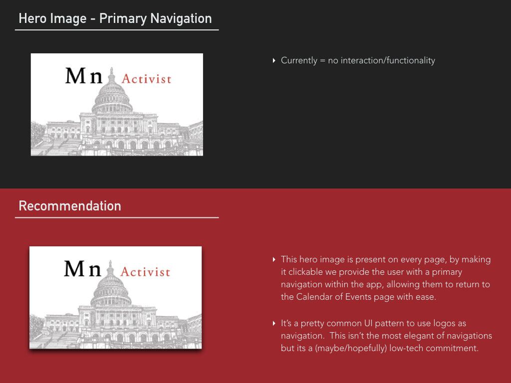
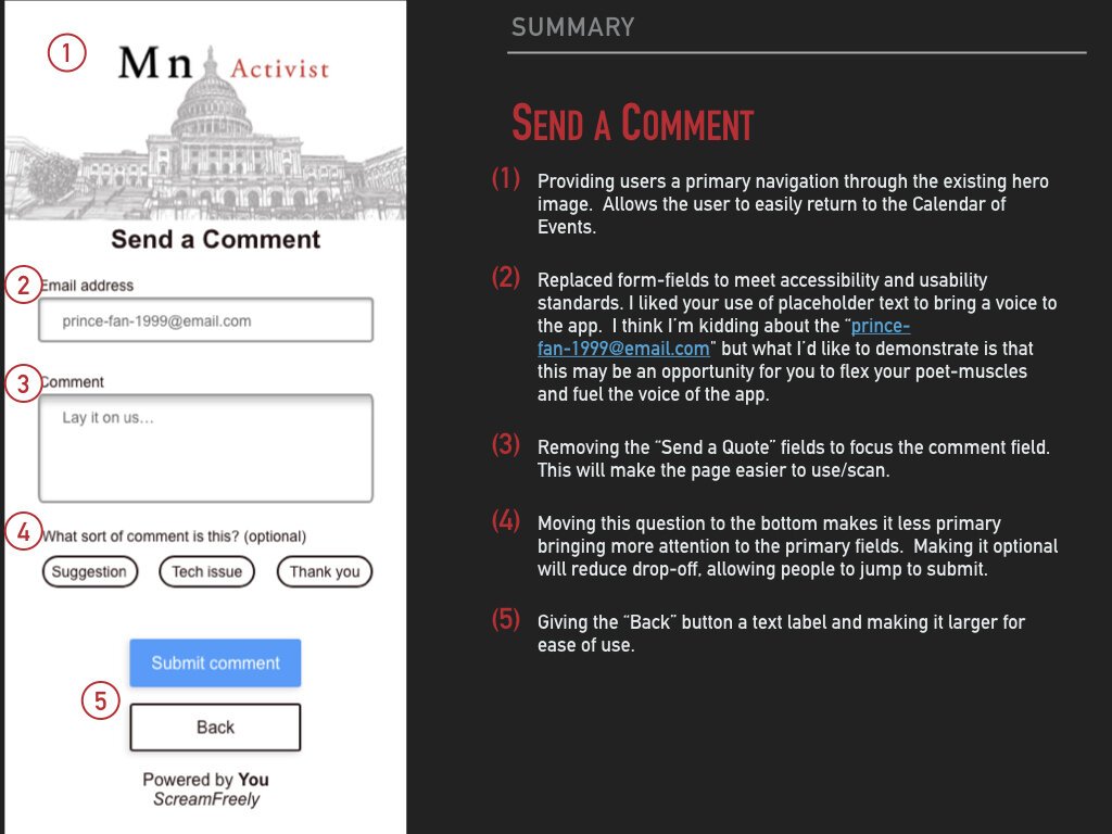
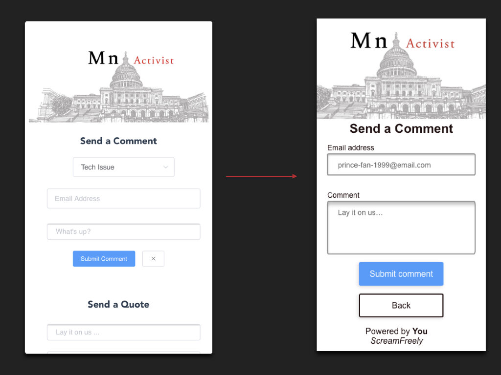
Initial research and design efforts provided quick-wins to improve usability and accessibility of forms and navigation. Such as, providing titles to form-fields, audits for color accessibility and increasing clarity of calls to action for navigation.
Design Strategy and Direction
Initial qualitative research explorations targeting quick-wins revealed much deeper opportunities but required new design explorations of the application.
Internal app navigation provided such strong reactions during initial testing that entirely new design concepts were explored. The concept pictured explores elevated navigations, which are not only common globally but tend to improve ease of use within layered mobile applications. They afford the user the ability to jump in and out of elevations while maintaining site-orientation.


